Tuesday 31 January 2012

Lacquer mixed with oil paint.


Today I was experimenting again, I applied thin washes of oil paint and while the surface was still wet I swirled and dripped white primer and lacquer. With minimal control I guided the paint in the direction I wanted, and then left the rest to chance.....

I love the way the lacquer has reacted with the primer; the liquids meet but dont blend together  leaving a cracked or broken edge. The lacquer has caused the thinned out oil paint to merge with the primer, this has left subtle changes in the colour.

I am really enjoying discovering different ways to create paintings I now need to think about how I can use these techniques in my work! 

Monday 30 January 2012

Edel Assanti- Curated by Gordon Cheung

Richard Mosse
Flower of the Mountain - 2011


(Detail)


Gordon Cheung
Ashes to Ashes - 2012


(Detail)


(Detail)


Alex Hoda
Double Helix - 2009


(Detail)


'Edel Assanti' is a show curated by Gordon Cheung.
'Flower of the Mountain' by Richard Mosse, is a fascinating sculpture, it feels like there is liquid paint being squeezed out from base and also poured over the work. I love the way the paint surrounds the shapes of the piece and the contrast in texture of the materials used underneath the paint.
'Ashes to Ashes' by Gordon Cheung a large painting (150 x 200cm) I am interested in his paintings and the techniques he uses, the newspaper is used as a ground for the piece and he then uses spray paint, ink jet spray and oil to overlay detail. The oil paint is applied using an iceing bag, I like the contrast of the swirls of colour which are applied thickly to an otherwise smooth, slick surface. The painting has a ghostly, surreal atmosphere and includes characters from scooby-doo!

'Double Helix' by Alex Hoda is a sculpture of the shape of a man and is made up of plastic toys, spiders, leaves, flowers and chain's tied together with string, glue gun and chains. It is a strange construction of wierd items which individually look like the artist may well have raided a pound shop! However placed together and wraped in chains the piece is reminiscent of childhood memories. The bright garish colours and tight structure has inspired me to paint from the photo's I took, it reminds me of some of Albert Oehlen's paintings, where there is so much infomation pushed into one canvas.

Friday 20 January 2012

Playing with Varnish.

Detail of varnish and thinned oil paint.


I was playing with the idea of making something feel like it was destroyed, without using a paint brush, I was thinking about taking away the element of control. When throwing paint at previous paintings I realised that, what was interesting to me was not knowing which part of the work would be destroyed, covered up or emphasized.... So I sent 'varnish' and 'oil' on a journey to see what would happen.... I Absolutely love the result; the bleeding of one liquid into the other creates unique pathways and forms interesting 'veins' as the liquid blends and separates.

Thursday 19 January 2012

Max Ernst


"The role of the painter is to project that which sees itself in him....." Max Ernst


The Eye of Silence - 1943
108x141cm


The Temptation of St. Anthony - 1945


I have been looking at these paintings by Max Ernst they are beautifully atmospheric and evocative. After watching a documentary about him, (link below), I'm fascinated with the methods he uses and the way he applies glass to a painted surface or area and then pulls it away, this creates a kind of texture to the surface. Apparently Ernst named this process 'decalcomania', he also invented 'frottage' and 'crotage'.


Wednesday 18 January 2012

Another Vandalised Painting


First stage of destroying painting.


After throwing paint to destroy this painting I worked back into the painting with oil, as with the 'Burning Bus'painting I tried to destroy, this painting also works better. However,  I think I need to vary the brush marks.


Tuesday 17 January 2012

Vandalising the Bus


Since 'Burning Bus' is an experiment I decided it would be the most willing of my current paintings to participate in vandalism. I used white house hold paint and after throwing it at the canvas I watched the paint drip and meander its way down the painting. I couldn't control the need to wipe away areas or encourage a wider spread of paint.... I also felt the need to throw thick varnish and turpentine at the canvas, the result being, areas of thinned out paint, which reveal parts of the painting beneath. I like the areas where the white paint is thick and obscures part of the work.


By trying to destroy this painting somehow I like it more...looking at the painting closely there are parts of the painting where the brush marks beneath the spalshes and drips have become more rich and emphasized next to the white drips, the overal painting seems more interesting and my eye is being drawn to different parts of the work due to the layers and the contrast in the marks and colours. 


Detail of 'Burning Bus'


I feel like this painting might work turned around up side down!


By turning the painting upside down I am finding details within the work which draw my eye, the drips were pulling my eye downwards, whereas I now feel like I can move across the painting looking into it rather than down it. The area on the bottom right hand side of the painting is particularly interesting as I love the way the varnish has spread with paint and left thin washes of paint against the dark background, also small shapes of orange, green and yellow poking through next to white....Looking at small segments of the painting has made me think about cutting the painting up... perhaps I need to vandalise it further?


Details from painting of 'Burning Bus'.


Monday 16 January 2012

Riots and Vandalism


As I travelled to Chelsea today I was looking at the graffiti which is pretty much on every available space between East Croydon and Victoria station, I thought about the shop fronts and buildings which have been destroyed and vandalised during the riots, the vehicles which were burned out and the pointless chaos that followed. I suppose what I find most disturbing is the fact that people thoughtlessly destroyed their own environment. What was the purpose of smashing up the windows of family run, local businesses? I remembered an artical I read in the newspaper about how many of the looters were from middle class families, (link below) and imagined the shock they must have experienced when they saw themselves on the news.... I thought about the act of destroying something, can I actually create a painting by an action? For example, if I tried to destroy or vandalise one of my paintings would the action create a painting?  The only way to find out is to vandalise my work!

Images of Vandalised Croydon


Saturday 14 January 2012

Picasso - Blue Period


Pablo Picasso blue period, self portrait
Self Portrait with Cloak - 1901


Pablo Picasso's Blue Period refers to a series of paintings in which the colour blue dominates, the blue period is an expression of personal melancholy. A significant influence on Picasso's blue period paintings was his visit to a woman's prison called St. Lazare in Paris, were nuns served as guards. In the painting 'The Visit', (below) the two figures were in fact a prisoner and a nun, the painting is an example of how Picasso used to mix daily reality with Christian iconography. The colour blue symbolizing Mary, the Mother of God, and the meeting or visitation, refers to the meeting between Mary and the mother of John the Baptist.
An ever returning theme in Picasso's blue period is the desolation of social outsiders, whether they be prisoners, beggars, circus people or poor or despairing people in general.


Pablo Picasso blue period, two sisters (the meeting)

 The Visit - 1902 

The colour blue
Some people believe that colour is associated with emotions, the colour blue being associated with melancholy. In the Anglo-Saxon culture blue is still interpreted as such and so it was in France during the nineteenth century when the colour blue was particularly fashionable among artists and the general public. In Christian iconography blue represents the divine and in a rather more secular (non-religious) sense it stands for the super-natural as well as the erotic.

 Poor People on the Seashore - 1902 


  Prositutes in a Bar - 1902


The Blue Room - 1901


The Blind Man's Meal - 1901


Picasso's blue paintings have a darkness about them which is both visual and sensory, in that, as a viewer I feel like I am experiencing something of the environment which would have been so familar to Picasso at the time. I am seduced and intrigued to find out more about Picasso's life as the paintings have a sadness which is clearly not purely evoked by colour but also subject. Picasso's close friend Carlos Casamegas commited suicide in 1901 and this had a profound impact on his work, clearly the 'Blue period' was reflective of his subject and also his state of mind. Also his confrontation with social reality was a motivation and not an end in itself; it was important to Picasso to experiment and test new visual approaches.

Sometimes in my own work I find that the subject becomes less important, the painting becomes more about experimenting. Working out what I want my paintings to do is still something I am unsure about. I know what subjects I'm interested in and I like to make work based on my environment. Many artists have tried to affect change through their work however having a passion or fascination for my surroundings feeds my paintings but it is not essential for the viewer to know what the work is about.


.

Thursday 12 January 2012

Blue Paintings

Blue 1

When I started making Blue 1 I used a photo, which showed detail of a building, rather than a broad view of the destruction of the riots. I think it is more interesting the less a viewer might know about the scene. If I was to crop the top of the buildings and the sky, the painting could work in a more abstract way. I may try taking a small part of the original image to make more paintings.

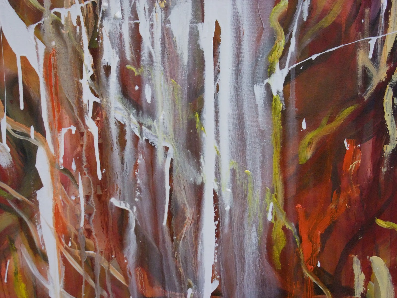
With regard to colour, Blue 1, initially had a ground colour of red/orange. I then painted with variations of blue, I could not control the urge to use a bit of yellow and green. I used a metal scraper to remove some of the layers of paint revealing some of the ground colour. There is a ghostly, desolate atmosphere to the painting and I'm sure colour has emphasized the sense of the destroyed, burnt out buildings.


Blue 2


I based this painting on 'Croydon's Burning 1' (below), which I made using colours similar to those in the original image, I wanted to see how different colours could affect image. Blue 2 is partly of the same image however I chose to use cold blue's for this painting, does it still feel like fire? Perhaps its because of  'Croydon's Burning' that 'Blue 2' still depicts a sense of fire and destruction for me, regardless of the colour. What does this do for my work? Well, what I do know is that it has clarified for me that I like the ambiguity in 'Blue2', the flames and burning buildings on the right hand side of the painting are undoubtedly visible to me, however a viewer might be totally oblivious to the fact that this is a painting based on fire and destruction. The viewer may not immediately notice the no entry signs or the fire hose across the bottom of 'Blue 2', and actually this is, for me, important that the audience has to think about the work. In contrast, the painting below, is a more obvious depiction which has no challenge for the audience.


 Croydon's Burning - 1


Blue 3

Blue 3 is work in progress, I decided to make a painting based on the feeling of 'Riots in Blue' not sure where this is going but its all part of my journey.

Wednesday 11 January 2012

Albert Oehlen


oehlen

The Snoring Fish, 2001, Albert Oehlen
240 x 380cm


Looking at the work of Albert Oehlen I am inspired by the different brush marks in his paintings. The Snoring Fish, is like two or three paintings overlayed and made into one, almost like a collage. The thin washes over previously painted areas contrast with solid areas of bolck colour and give the painting deepth, with other parts of the painting (for ex bottom left) the image feels like it is pushing its way forward towards the viewer. With regard to my own paintings I've been thinking about how much is too much.... is it indeed possible to put too much infomation in a painting? I think in Oehlen's paintings the variety of thickness in line and brush marks creates movement, it pulls you in different directions, I find myself struggling to find a space to concentrate on as my focus is constantly pulled towards different parts of the painting. 


Piece


Piece, 2003, Albert Oehlen
280 x 340cm

Colour is an area in my painting which feels slightly alien at the moment, I'm playing with different ways of using colour and trying to find out what colour is doing to my work. I've been making blue paintings as I found myself surrounded with fire, my space felt too hot and my eyes were tired of seeing bright red, yellow and orange! Oehlen's painting, Piece, is interesting in the way that the green seems to receed and the yellow feels pushed forward. The white areas allow the other colours space. I wonder if this is more to do with the composition, if the white was black would the painting still work? Does the painting work because there is space within the composition or is it due to the white space? Perhaps space as well as colour is what I should be thinking about.

Monday 9 January 2012

'September' - Gerhard Richter

A Gerhard Richter print from 2009.
'September'


Richter's painting of 'September' is a relatively small painting, 52 x 72cm, Richter resisted enlarging his canvas to the scope of the event and instead found more meaning in a domestic size. 'September' is close to the size and shape of a flat-screen TV, matching the proportions of the vessel through which we learned the terrible news.


Richter said that, even with the scale right, when he originally tried to paint the burning towers, in 2005, he couldn’t stomach the results. Working in his classic photo-realist style, he found that the towers’ glowing flames felt garish and attractive. Richter took his failed painting, scraped off most of its surface detail, and smeared an abstract veil of grey on top of what was left. Richter applied the techniques of unpainting and since the subject is the erasure of a building, it’s the perfect metaphor.

Richter gives us a way to view the carnage: the image is so imprinted on our psyches that we recognise it in a painting that is close to obliterated. How can a painting contain the scale, scope and meaning of the moment? As a painter how can you do justice to a theme such as this? Richter's blurred and almost unseeable painting gives you a sense of the violence, catastrophe and enormity of the subject. It would seem impossible to condense such a subject into art, yet Richter has made a painting which feels somewhat haunting and true. 

Saturday 7 January 2012

Exhibition Part 2


My painting 'Croydon's Burning' in the show. 


Spending 2 days curating a show with loads of fine art students was a challenge and well worth the effort. Reflecting on the experience, it was exciting to be given the oportunity to work with other students to put together a show in the Triangle Space, which due to its shape is challenge enough. With many opinions, ideas and needs we worked hard as a team, to make sure we understood each others work and that we were all happy with how the show was developing. It was an interesting lesson which placed huge emphasis on how difficult a curators job is. With diplomacy, understanding and patience the show was a success.

Tuesday 3 January 2012

Richter's Influence

Destruction - 3


I am trying to keep my work loose, I don't want to recreate a photograph, my work is more about interpreting an image. Destruction - 3 was initially a detailed painting of a burning house, even though it was supposed to be a painting about destruction, it somehow felt happy. I continued to layer paint until the surface became more textured. I then decided to obscure some of the image in a random way... allowing only part of the image to be seen. I'm interested in what happens when part of the image is covered, then scrape away or remove part of it.

Colour


Destruction - 1

Something strange is happening to colour.

I've been looking at paintings with bright vivid colours, Ashile Gorky's
paintings (below) have biomorphic forms and strong colours, they evoke a
mood and have a strong energetic presence. I'm trying to understand
colour in my paintings and have been working mainly with
colours which relate to fire, perhaps I'll try the opposite....Blues?
 
Paintings By Ashile Gorky


 Destruction - 2


Burning Bus